This post is about some of the design tools we use at Cloud City.
In the early days of being a UX designer, I lived by the following maxim:
New project = new tools.
The tools marketplace was in such flux that I felt lucky if I went more than six months without switching tools. First it was Photoshop and Illustrator, followed by Fireworks. Once Fireworks died, (RIP), it was back to Illustrator - with some InDesign, Omnigraffle and Balsamiq mixed in where needed. Finally, along came Sketch and Invision, and UX designers everywhere heaved a collective sigh of relief.
No more reinventing the wheel
Having a stable toolkit is one thing; making sure you can productive and efficient is another entirely. Let me explain.
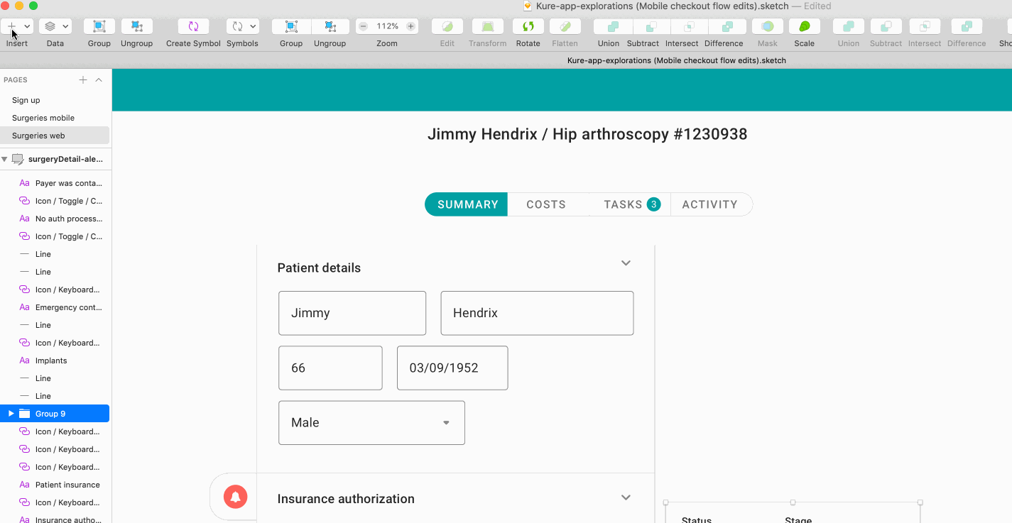
Once a project has begun, much like an artist faced with a blank canvas, I’m faced with an empty Sketch file, devoid of artboards and filled with endless possibility. This feeling of creative bliss is typically short-lived, because before long I start creating - and recreating - UI elements that I’ve made dozens of times before.
The running narrative inside my head sounds something like this:
Ah, I need a dropdown here. What style do I want? I’m thinking flat, maybe borderless, for a clean look that’ll fit with the brand. Wait, will this work in a mobile context? What about that awesome rounded pill style I tried a few months back… that might fit in here, but which Sketch file is it in? …
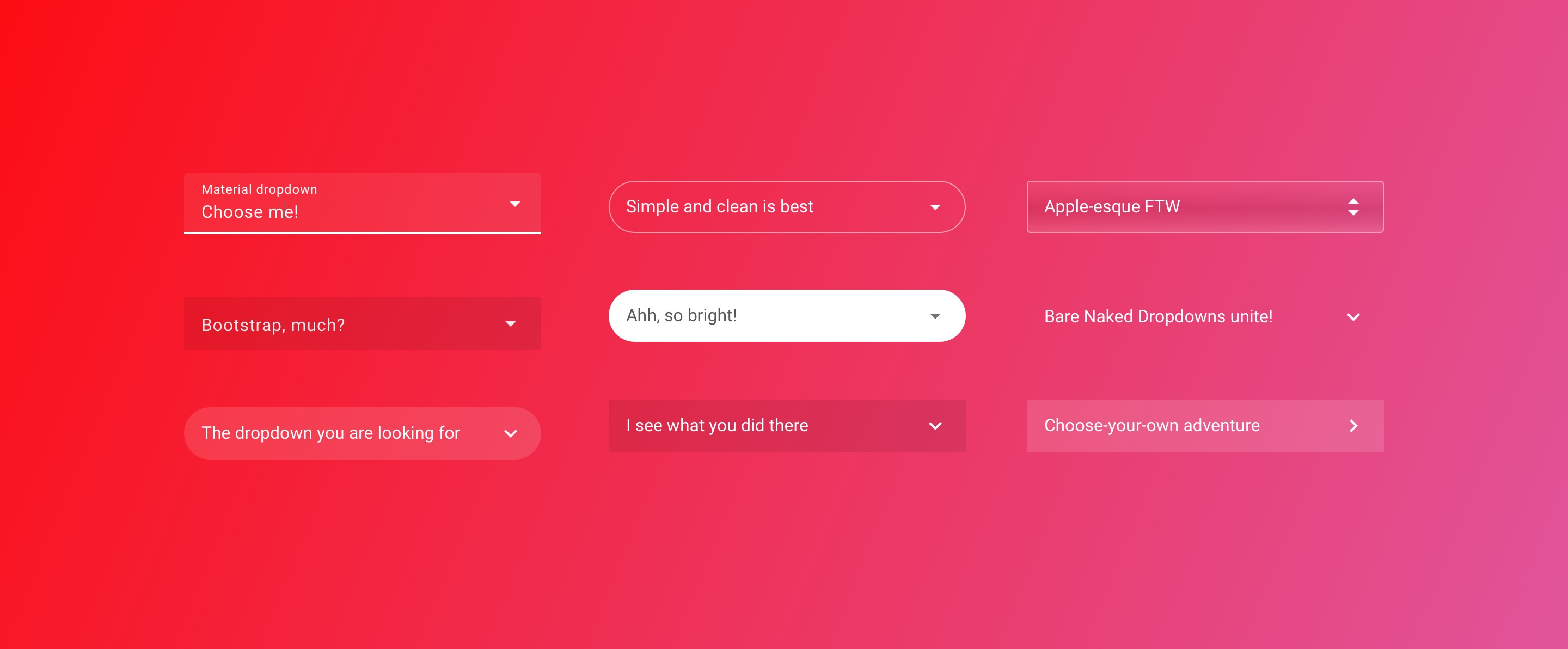
Having to remake elements or find older examples to modify might not seem like a big deal, but in the early stages of designing a UI, it’s often better to focus on UX workflows and user stories rather than the look and feel of something. Deciding on design minutiae takes some cognitive overhead, and can be significantly distracting.
One way to get around this challenge is by starting lower on the fidelity scale - think pen and paper or wireframes. However, when in a time crunch, there is another way: UI component systems.
Enter Google Material Design.
Source: Material.io
Google Material Design - the lowdown
Material Design started life in 2013 as an internal Google project to unify their UI design language. With dozens of products across a range of platforms and industries, not only was the product lineup looking visually fragmented, there was a significant internal cost to maintaining so many different designs and their codebases.
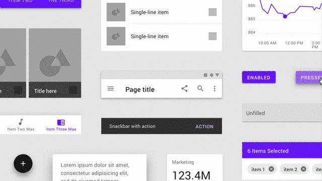
Material takes a mobile-first approach, and has strong opinions on depth, animations and information layout. More importantly, each and every UI element - from drop-downs to photo cards to the famous FAB button animation - has a corresponding frontend component, meaning that UX designers and engineers can build product in a unified way.
Almost every product team eventually builds a brand guide and/or component library, so it’s really nice to have one ready to go out of the box.
If I’m honest, Material certainly had rough edges when it first came out. While I was working on the AdWords team at Google, I remember being frustrated that it was missing crucial components and design elements for something more complex (take a look at the AdWords remarketing tool to see what I mean!). Further, the visual language was so generic that every application designed with Material ended up looking bland and very similar - not good when you’re trying to make a product stand out.
Fast forward to 2018: Material Design has matured immensely. The development library is more extensive, and the visual design guidelines have been relaxed to make it easier for UX designers to make Material their own. Best of all? There’s an official Sketch symbol library with hundreds of UI elements, fonts, and the flexibility to customize styles with the powerful Theme Editor Sketch plugin. Sold!
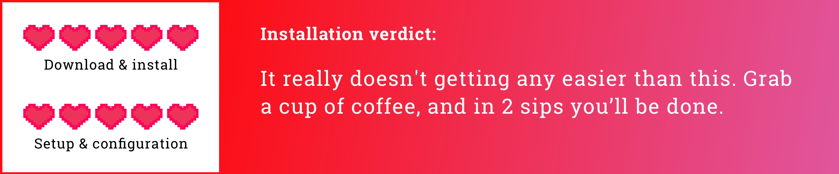
Installing Material Design
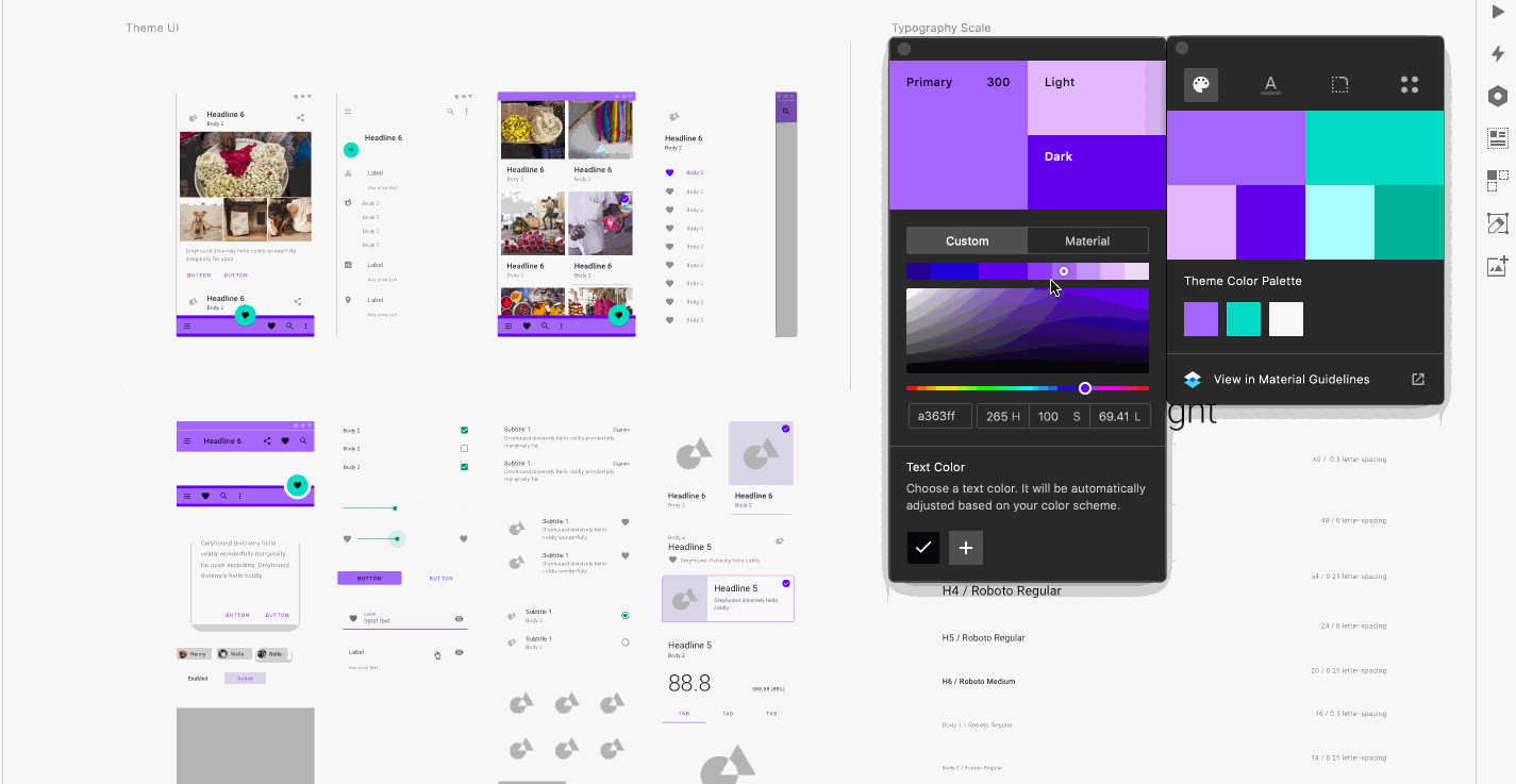 Nifty, universal editing for color palettes, typography and other styling.
In true Google fashion,, getting up and running with the Material component system is a cinch:
- Install the Material Design Theme Editor plugin, which includes the Editor and Sketch symbol library
- Modify the base theme until you’re happy with it. I went with Roboto and initially left everything else boilerplate.
- Lastly, add the library to a Sketch file by going to Preferences > Libraries > Add library…and you’re done!
Using Material Design
The biggest thing I look for when trying out a new tool is how it fits into my existing workflow, as any deviation can slow me down and throw me off track when I’m in the throes of a design problem.
Right off the bat, the fact that Material provides a Sketch symbol library is a huge win. Symbols have really matured into the bedrock of the Sketch ecosystem and have sped up my workflow at least tenfold. If you’re disciplined, regularly converting UI elements into reusable symbols will save you tons of time, as every edit will propagate automatically.
However, if you’ve tried building your own symbol library from scratch it really is a PITA, so being able to rely on Material’s comprehensive symbols is a godsend. The library handles almost every UI state you could think of, including states like pressed, resting, hover and disabled. The number of times I’ve made it 75% of the way into a design only to realize I forgot to design the error state for an input field…
That’s quite the symbol library you have there, friend.
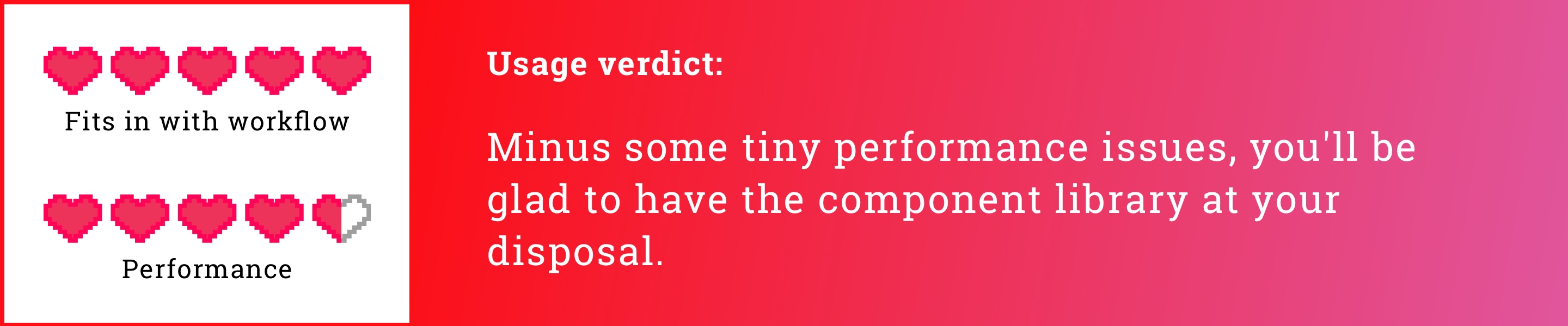
One downside of working with such a big symbol library is that I encountered the odd performance slowdown when accessing and inserting symbols. In addition, because the library is so damn big, sometimes finding the right thing can take a minute - a nice problem to have, all things considered, but a problem just the same.
Perhaps the best part of using Material were the squeals of joy from my engineering team when they discovered that everything I was designing also had its code counterpart. Not only that, but Material design encourages using a grid system, is Flexbox-friendly, and is written in React. Woohoo! I can’t explain how much more efficient this made us, as the usual back-and-forth around layout, color selections, and padding discrepancies basically dropped off entirely.
Overall take on Material: just do it already
There are a ton of component libraries out in the wilds of UX Land , but none are as comprehensive, and certainly none as modern, as Material. So if you’re an UX designer, Material will up your efficiency game significantly, and make you popular with your engineering colleagues to boot. Give it a shot today, what do you have to lose?