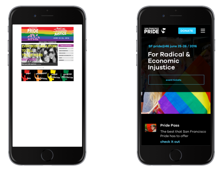
After producing a world class event for 45 years, it was time for SF Pride to have a world class website that honored their heritage and gave them room to grow into the future.
Working with SF Pride, we created a mobile-first, responsive website that supports nearly a million mobile users during the annual two-day June Celebration and allows the staff to make quick edits and expand the site’s functionality over time. Today, we are proud to unveil the results of our collaboration and share a bit about the project.
Needs
SF Pride is more than just the annual June gathering of LGBT people and allies. Year round the organization advocates for equality and supports local non-profit LGBT organizations and organizations working on issues related to HIV/AIDS, cancer, homelessness, and animal welfare. The website though didn’t reflect this.

Each year SF Pride updated the website to mirror the theme and color palette of the coming year’s celebration and parade. The constant change resulted in an unwieldy site of over 200 hundred pages with inconsistent branding. Its small non-technical staff was unable to quickly update the site following the event. With 80% of its site traffic happening in the last three weeks of June and then tapering off in July, it was important to educate new visitors on how they could be involved post-celebration, such as donating or becoming a member.
Our Collaboration
Working with the team using core-model workshops, mobile-first designs, and agile development, we created a site that would have a cohesive feel, structure, and behavior.
Core Model

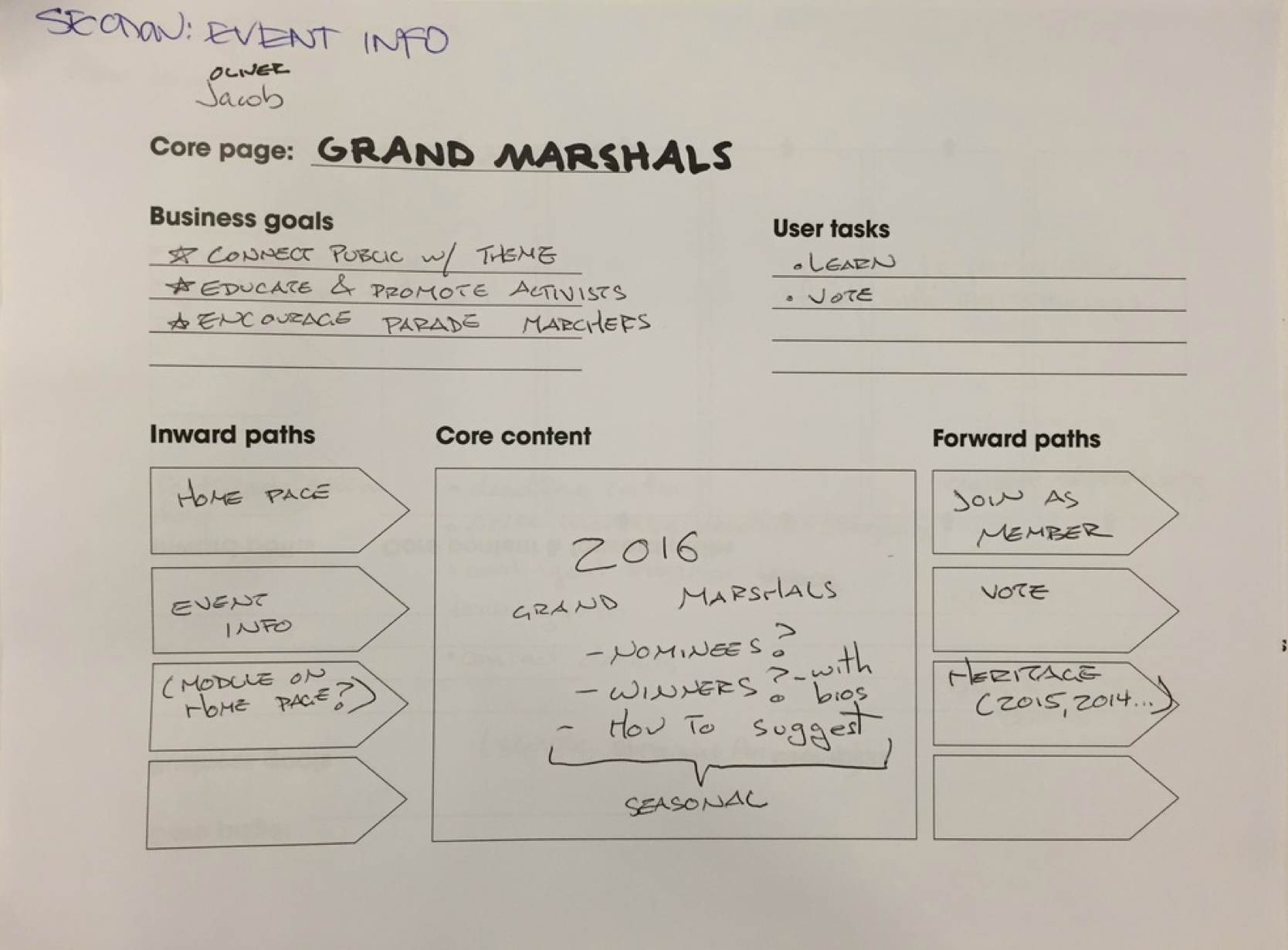
Our design process started with a core model workshop, in which SF Pride met with our design team to consider the core functions and organization of each page on the site, and decided what content was essential to deliver value to SF Pride and it's users.
For each page, we established six things:
- Name and Function (naming things is always hard)
- Business Goals (“Inform visitors about lineup”)
- Defined User Tasks (“where can I park?”, “what is the parade route?”)
- Analyzed Inward Paths (How will a user arrive here? Maybe from “Event info?”)
- Obvious Forward paths (Where will they go? Maybe “schedule”, or “parade route”?)
- Core Content (How little can we put on this page and still serve business goals and our users?)
The core model sheets are primarily a tool for the content strategist (the person responsible for managing what goes on each page). Once content is decided, the sheets help inform design and development.
Mobile First Design

Designing mobile first is one of the many buzzwords that’s been tossed around long enough to be passé, and yet it’s still an important methodology for developing websites. 80% of SF Pride’s visitors are on mobile and it’s easier to scale from mobile to desktop that vice-versa.
Referring back to our core model sheets, it was easy to ask, “if it’s not important enough to put on mobile, is it important enough to put on the desktop?” Our design team used the core model sheets to create pages that scaled up from mobile to desktop, keeping layout as similar as possible across different resolutions.
Mobile first serves as another step in the process of simplifying the form and function of a site.
Design Reviews
Good design requires commitment and communication. Weekly design reviews ensured that clients, designers, and developers understand and support the form and function of what is being built and ensure that any issues are discovered and dealt with as early as possible. Good design isn’t created in a vacuum: we rely on our clients to be partners in everything that we do.
Next steps (To infinity, and beyond!)

Our work, like SF Pride’s, is just a step in the right direction. SF Pride wanted to reach a point of stability and usability in its online presence that would allow them to focus on its core mission: education, commemoration, celebration, and liberation of the LGBT community. Its new site is a start, and we look forward to seeing it grow.
For us, diversity and inclusion aren’t just buzzwords. They are central to our culture, and we work to create a community where all are welcome and respected. Our tech lead Andre Arko only speaks at conferences with 20% or more speakers from marginalized or historically excluded populations, and has written about why including people in tech matters and how to be an ally. Our Director of UX Davina Pallone served on the board of the Utah Pride Center and has supported numerous non-profits throughout her career. Working on the SF Pride website was an obvious fit for our skills and creed, and we are incredibly proud to have been a part of furthering SF Pride’s mission.
The Why
We want to work on what matters in the world. Justice matters, open access science matters, health technology matters. We work because we believe that technology can be used to increase and foster justice, transparency, and well-being. Have a project that needs flexible expertise? Let's talk.